darktable preset inspired by KodakKodachrome 200
Kodachrome-style slide look with gentler contrast than the 64, a warm drift and visible grain.
- Film
- GA — 077 · sheet, datasheet, sources
- Pack
- Full pack
- darktable
- 5.6 or later
- In darktable
- Styles › Pellicules › Diapo
- File
- Pellicules - Diapo - Kodak Kodachrome 200.dtstyle
A darktable 5.6 style built from the Kodak Kodachrome 200 datasheet: native modules, no LUT, measured on real RAW files. In the full pack.
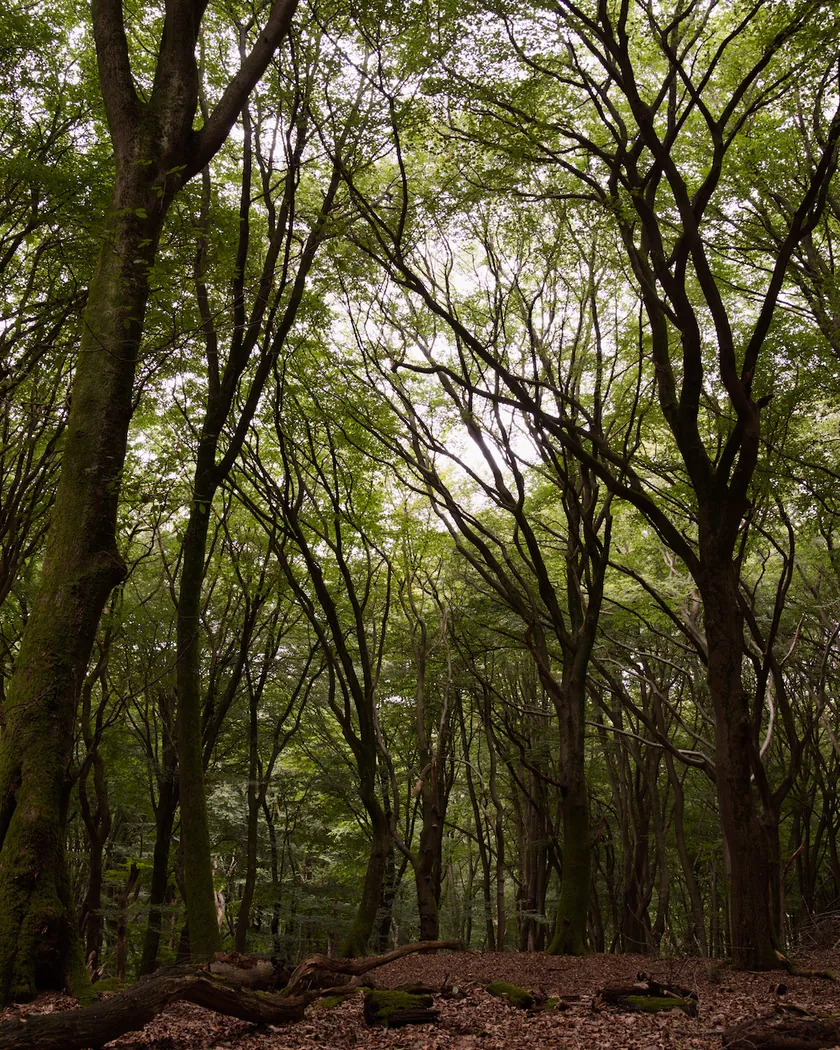
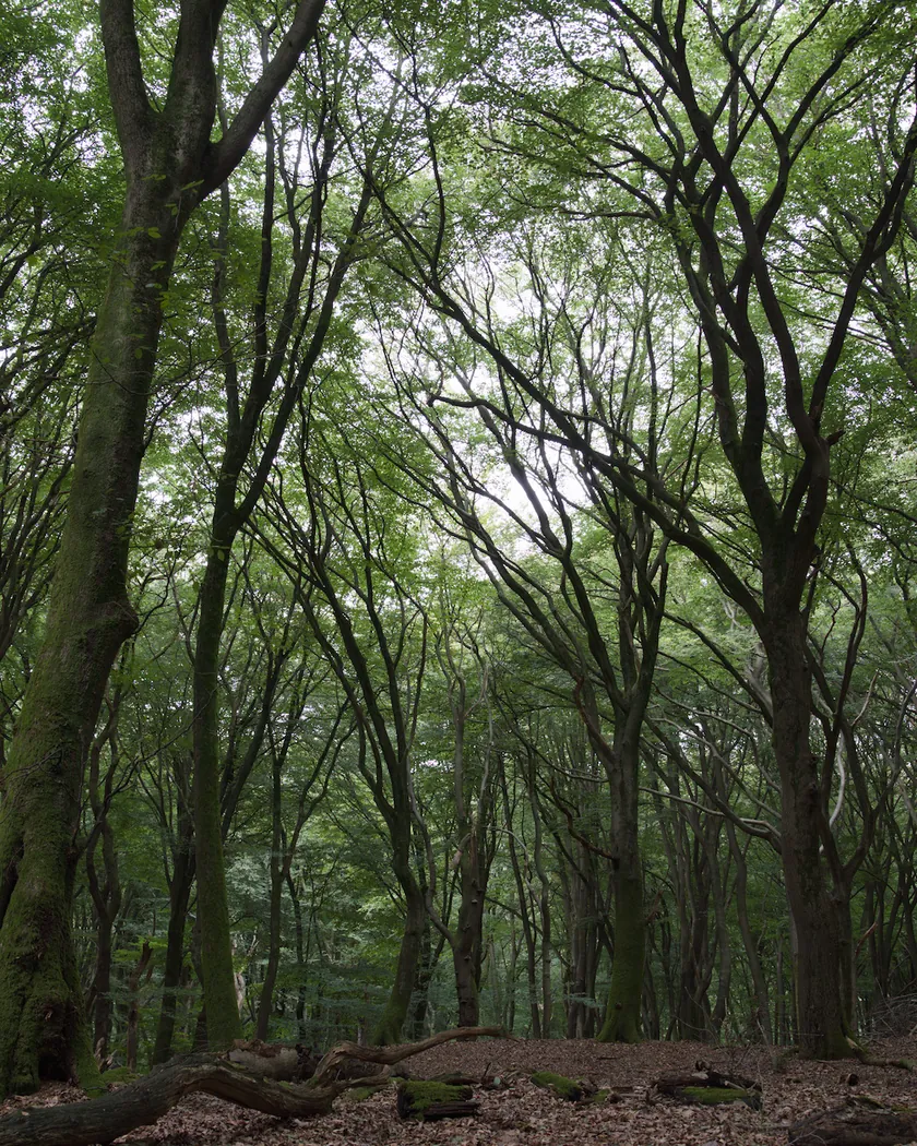
Translation into darktable
| Module | Role | Settings |
|---|---|---|
| rgb primaries | Blues turned slightly toward cyan, as in the Kodachrome 64 style | Blue hue −0.03 rad |
| color balance rgb (instance “film”) | Warm drift in the midtones and highlights, slightly lower saturation than the 64 style | Midtones 45° / 0.013, highlights 50° / 0.026, global saturation −0.07 |
| color equalizer | Kodachrome reds and yellows, more restrained than the 64 style; oranges toward red, sober greens, darker blues | Red: saturation ×1.05, brightness ×0.95; orange: hue −4°; yellow: saturation ×1.10; green: saturation ×0.90; blue: brightness ×0.92, hue −9° |
| tone curve (RGB, per channel) | Gentler slope than the 64 style, slightly more open shadows | Nodes (0, 0) (0.1, 0.045) (0.25, 0.20) (0.5, 0.495) (0.75, 0.775) (0.9, 0.915) (1, 0.985) |
| grain | Visible but not coarse grain, for RMS 16 | Coarseness 800, strength 22, midtones bias 80 |
Measurements
The measurements come from a few test photos of our own, which are not published on this site. The photos shown here are different.
| Photo | Zone | Baseline | Metric | Before | After | Film expectation |
|---|---|---|---|---|---|---|
| 0775 | whole image | Base rendering | Lsd (contrast) | 14.3 | 16.7 | Higher than the base, slightly below the Kodachrome 64 style (16.9) |
| 1014 | whole image | Base rendering | Lsd (contrast) | 30.7 | 33.1 | Higher than the base, slightly below the Kodachrome 64 style (33.5) |
| 1014 | whole image | Base rendering | L5 (blacks) | 2.6 | 0.9 | Deeper blacks, with the shadows more open than the 64 style (0.7) |
| 0775 | sky | Base rendering | C (chroma) | 27.5 | 21.6 | Slightly lower saturation than the 64 style (31.1) |
| 0775 | sky | Base rendering | h (hue, °) | 273.6 | 267.4 | Blue still leaning toward cyan |
| 0989 | skin | Base rendering | C (chroma) | 16.4 | 22.8 | Warmer skin; the chroma stays at the level of the 64 style (22.4) |
| 0989 | skin | Base rendering | h (hue, °) | 44.2 | 45.7 | Warm drift, modest on skin |
| 1014 | pink T-shirt | Base rendering | C (chroma) | 33.7 | 40.3 | Rich reds, a little below the 64 style (41.9) |
| 1014 | pink T-shirt | Base rendering | h (hue, °) | 358.8 | 13.0 | Warm drift: +9° compared with the 64 style (3.5) |
Base rendering: darktable’s default processing of the RAW file, without the preset. Luminance conversion (black and white): the same photo converted with plain luminance weights, to isolate the effect of the film’s spectral sensitivity.
What the style changes
The style uses five darktable modules. It starts from the Kodachrome look of the Kodachrome 64 style and moves it toward the 200 as far as the sources allow: less contrast and less saturation, a warmer drift and visible grain. The 200 is thinly documented, so this is a cautious interpretation, detailed on the Kodak Kodachrome 200 film page. All figures below come from renders made with darktable-cli 5.6.0 at 1000 px, measured in CIELab.
- Contrast, a little below the 64 style. The tone curve is gentler than the 64’s, following the softer midtone slope we read on the datasheet graph. Contrast rises from Lsd 14.3 to 16.7 on photo 0775 (16.9 for the 64 style), and from 30.7 to 33.1 on photo 1014. The darkest 5 % of photo 1014 fall from L 2.6 to 0.9.
- Less saturated sky. Sky chroma goes from 27.5 to 21.6, against 31.1 for the 64 style, and the hue moves from 273.6° to 267.4°, still leaning toward cyan.
- A warm drift. The “film” color balance rgb instance tints the midtones and highlights amber. Skin hue moves by +1.5° and the pink T-shirt by +9° compared with the 64 style. The effect stays modest on skin.
- Restrained reds and yellows. The color equalizer raises red saturation by 5 % (15 % in the 64 style), darkens reds slightly, pulls oranges 4° toward red and raises yellow saturation by 10 %. The T-shirt goes from chroma 33.7 to 40.3.
- Sober greens and darker blues. Green saturation is lowered by 10 %; blues are darkened and turned 9° toward cyan.
- Visible grain. Kodak rates the film at RMS 16 (Kodachrome 64: 10), so the grain module adds a visible, non-coarse grain. We checked it by eye on a 2560 px render of the sky: visible, without posterization. It is not measured.
For comparison, the t3mujinpack style for this film, rendered on the same files, desaturates more: sky chroma 18.9 against 21.6 here. This style follows the “slightly lower saturation” brief without going as far.
What it leaves alone
- Your base development. The style contains no exposure, no sigmoid or filmic, no white balance and no LUT: those settings stay as you made them.
- Your pipeline order. The style file carries no module order list, so it does not impose one on your image.
- Your own color balance rgb. The style’s instance is named “film”, so it is added next to yours without changing it (unless the photo already has an instance named “film”).
What it does not leave alone: applied from the lighttable or the darkroom, each unnamed module of the style, rgb primaries, color equalizer, tone curve and grain, replaces your instance of the same module if you have one. Your earlier settings stay in the history stack. Exporting with a style, or rendering with darktable-cli as our measurements do, adds the modules as separate instances instead. Details in Install and apply darktable styles.
Limits
- Few sources. The style rests on one Kodak datasheet, user reports and one article with reader comments. We found no detailed review of Kodachrome 200 in color.
- Approximate curve. Slopes and D-max come from a visual reading of the datasheet graph, not from a measurement.
- Chosen values. The warm drift and the saturation levels were chosen to set the style apart from the 64 one; no source gives figures for them.
- Sources disagree on the warmth. A warm cast is supported only by a retailer listing seen in search results; another user report mentions a pink cast in overcast light, which the style does not reproduce.
- Greens. The sources we found do not describe the 200’s greens; the ×0.90 saturation is a guess.
- Shadow separation. On the datasheet, the red, green and blue curves separate in the shadows. The style does not reproduce that channel by channel.
- Skin. Skin saturation stays at the 64 style’s level (chroma 22.8 against 22.4): the lower saturation only shows on the sky, the sea and the whole of photo 0775.
- No film behavior. Reciprocity, push processing (the magenta-red shift) and the K-14 process itself are not reproduced.
Tips
- For a stronger drift, raise the highlights chroma of the “film” color balance rgb instance.
- For less grain, lower the strength in the grain module: visible grain is a choice, not a datasheet requirement.
- Installation: see Install and apply darktable styles.
Get the preset
GA — 077 / P · darktable preset
Kodachrome 200
for darktable