darktable preset inspired by KodakUltraMax 400
Consumer warmth with clear, cyan-leaning skies and firm contrast.
- Film
- GA — 009 · sheet, datasheet, sources
- Pack
- Full pack
- darktable
- 5.6 or later
- In darktable
- Styles › Pellicules › Couleur
- File
- Pellicules - Couleur - Kodak UltraMax 400.dtstyle
A darktable 5.6 style built from the Kodak UltraMax 400 datasheet: native modules, no LUT, measured on real RAW files. In the full pack.
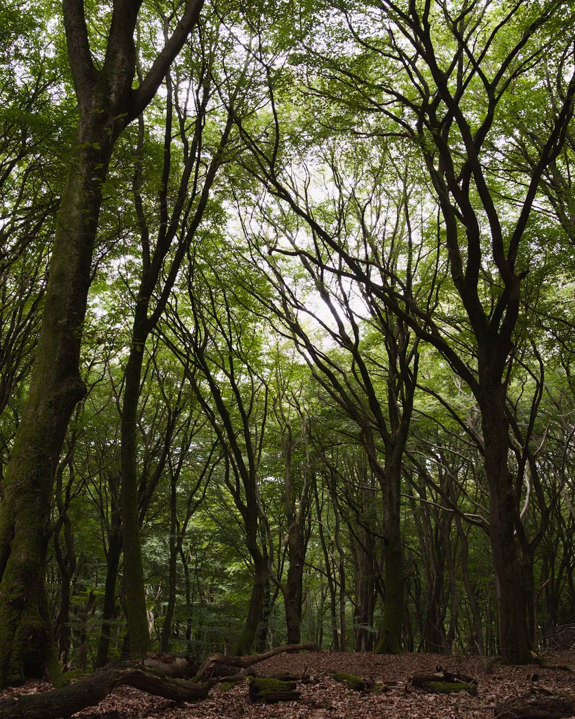
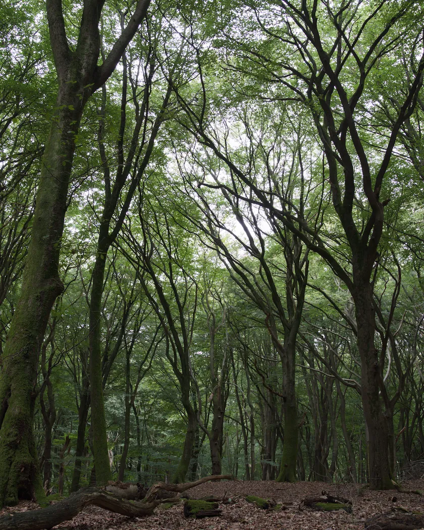
Translation into darktable
| Module | Role | Settings |
|---|---|---|
| rgb primaries | Greens slightly toward yellow, less than the Gold 200 style; blues toward cyan, which the warmth would otherwise push toward violet | Green hue −0.03 rad, blue hue −0.05 rad |
| color balance rgb (instance “film”) | Light warmth; shadows neutral to warm, not blue as in the Gold and Portra styles; moderate extra saturation | Midtones 60° / 0.008, highlights 60° / 0.012, shadows 40° / 0.006; saturation +4 % |
| color equalizer | Richer skies and greens; skin held back, because the per-channel curve already saturates oranges | Saturation: blue ×1.12, green ×1.10, orange ×0.85 |
| tone curve (RGB, linked channels) | Medium-to-high contrast, firm blacks, late shoulder | Nodes (0, 0.015) (0.10, 0.06) (0.25, 0.20) (0.5, 0.505) (0.75, 0.81) (0.9, 0.93) (1, 0.975) |
| grain | Sized from the Print Grain Index of 46: a little stronger than the Gold 200 style, less attenuated in the shadows | Coarseness 1700, strength 22, midtones bias 75 |
Measurements
The measurements come from a few test photos of our own, which are not published on this site. The photos shown here are different.
| Photo | Zone | Baseline | Metric | Before | After | Film expectation |
|---|---|---|---|---|---|---|
| 0775 | whole image | Base rendering | Lsd (contrast) | 14.3 | 17.6 | Medium-to-high contrast |
| 1014 | whole image | Base rendering | Lsd (contrast) | 30.7 | 33.6 | Medium-to-high contrast |
| 1014 | whole image | Base rendering | L5 (blacks) | 2.6 | 2.5 | Firm blacks |
| 0775 | sky | Base rendering | C (chroma) | 27.5 | 32.5 | Rich, bold skies |
| 0775 | sky | Base rendering | h (hue, °) | 273.6 | 269.6 | Skies slightly toward cyan, not violet |
| 0775 | sea | Base rendering | C (chroma) | 22.2 | 25.9 | Richer blues |
| 0989 | skin | Base rendering | C (chroma) | 16.4 | 17.8 | Accurate skin (Kodak): barely more saturated |
| 0989 | skin | Base rendering | h (hue, °) | 44.2 | 50.2 | Slightly warmer skin |
| 1014 | pink T-shirt | Base rendering | C (chroma) | 33.7 | 41.8 | Saturated reds |
Base rendering: darktable’s default processing of the RAW file, without the preset. Luminance conversion (black and white): the same photo converted with plain luminance weights, to isolate the effect of the film’s spectral sensitivity.
What the style changes
The style contains five darktable modules. It aims at the UltraMax 400 described on the Kodak UltraMax 400 film page: punchy consumer color, rich skies, a light warmth, medium-to-high contrast and visible grain. All figures below come from renders made with darktable-cli 5.6.0 at 1000 px, measured in CIELab.
- Punchier contrast than Gold. The tone curve firms up the blacks, steepens the midtones and bends only late in the highlights, between the Gold 200 and Portra 400 datasheet curves. Contrast rises by about 3 (Lsd 14.3 → 17.6 and 30.7 → 33.6), a little more than the Gold 200 style (+2.5 and +1.9). The blacks hold (L5 2.6 → 2.5), and the brightest 5 % rise from L 87.9 to 91.6.
- Rich skies: the main difference from Gold. The color equalizer raises blues and greens, and rgb primaries turns blues slightly toward cyan. Sky and sea gain 18 % and 17 % of chroma, with the sky moving from 273.6° to 269.6°. The Gold 200 style does the opposite and lowers them. t3mujinpack goes the same way (+11 % and +15 %).
- Light warmth, neutral shadows. The “film” color balance rgb warms the midtones and highlights slightly and gives the shadows a faint warm tint instead of the blue of the Gold and Portra styles. On photo 1014, a white wall moves from b* −1.2 to +0.8 (Gold 200 style: +2.3), and a cast shadow from b* −3.3 to −0.2. A lab comparison found UltraMax’s shadows yellow-reddish where Portra’s were blue-green.
- Restrained fair skin, saturated reds. Fair skin gets warmer (h +6°) but barely more saturated (+9 %), in line with Kodak’s “accurate skin-tone reproduction”. Reds and pinks gain 24 % of chroma and turn only 9° toward orange (Gold 200 style: 19°).
- Visible grain, sized from Kodak’s Print Grain Index of 46, a little stronger than the Gold 200 style (44) and less attenuated in the shadows, where reviews see it most.
What it leaves alone
- Your base development. The style contains no exposure, no sigmoid or filmic, no white balance, no color calibration and no LUT, so those settings stay as you set them.
- Your color balance rgb. The style’s instance is named “film”, so it is added next to the color balance rgb you tuned on the photo instead of replacing it.
- Your pipeline order. The style file carries no module order list, so it does not impose one on your image.
- But not your settings in its other modules. When you apply the style from the lighttable or the darkroom, darktable 5.6 replaces an existing instance of the same module: if you had already adjusted rgb primaries, color equalizer, tone curve or grain, the style’s settings take their place. Your earlier settings stay in the history stack. Applying the style at export, or with darktable-cli as in our measurements, adds every module as a separate instance instead. See Install and apply darktable styles for the details.
Limits
- An interpretation, not a calibration. The style is built from Kodak’s datasheet and published reviews. No film was scanned or measured to tune it.
- Contradictory reviews. Sources disagree on the overall cast (warm or rather neutral), on reds (vivid or restrained) and on grain (very fine or coarse). The style keeps a light warmth, vivid reds without excess and a grain slightly stronger than Gold’s, following the datasheet.
- Layer slopes. The datasheet curves are Status M densities of the negative: the small slope differences between layers do not translate directly into print casts, and the style does not simulate them.
- Tanned skin. Because the tone curve works channel by channel, tanned skin gets much more saturated (+45 %, C 28.2 → 41.0) than fair skin (+9 %). A first version pushed fair skin to +63 %; the style now holds back oranges.
- Not simulated: the shadow casts of underexposed frames or overcast days.
- Fujifilm 400. Whether it is the same emulsion is not confirmed. The style can serve as an approximation, nothing more.
Tips
- Compare with the Gold 200 style on two duplicates of the same photo: the difference lies mostly in the skies and the shadows.
- If tanned skin looks too strong, lower the orange saturation of the style’s color equalizer instance further.
- Everything stays editable. Each module the style adds is an ordinary instance: you can adjust it or switch it off afterwards, for example the grain strength.
- Installation: see Install and apply darktable styles.
Get the preset
GA — 009 / P · darktable preset
UltraMax 400
for darktable