darktable preset inspired by LomographyLomoChrome Metropolis
Muted, low-saturation color with hard contrast, deep blacks and coarse grain; reds stay strongest.
- Film
- GA — 040 · sheet, datasheet, sources
- Pack
- Full pack
- darktable
- 5.6 or later
- In darktable
- Styles › Pellicules › Effets
- File
- Pellicules - Effets - LomoChrome Metropolis.dtstyle
A darktable 5.6 style built from LomoChrome Metropolis reviews and Lomography's film guide: native modules, no LUT, measured on real RAW files. In the full pack.
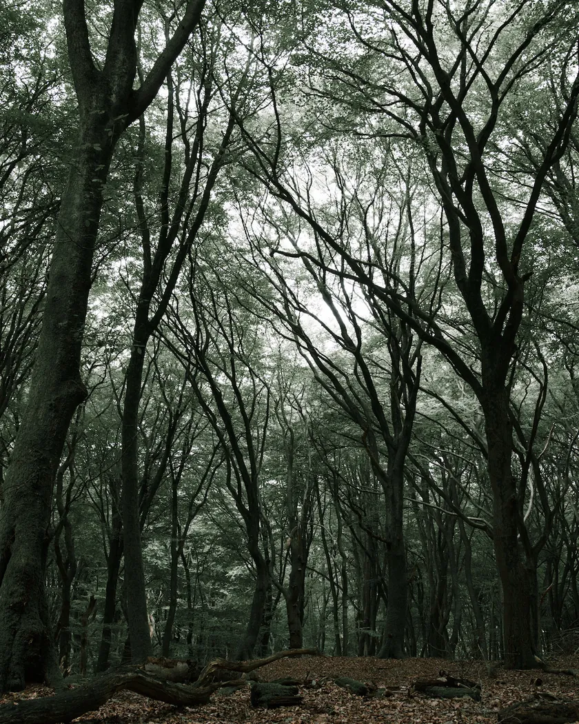
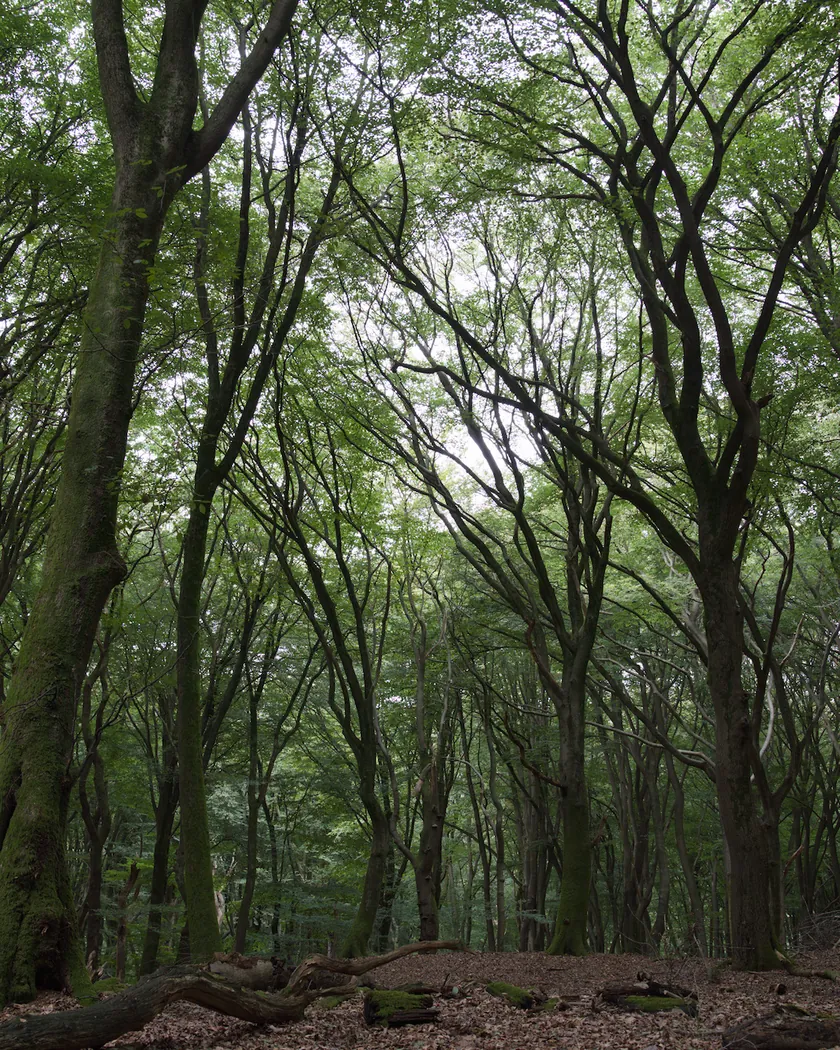
Translation into darktable
| Module | Role | Settings |
|---|---|---|
| rgb primaries | Greens pulled slightly toward yellow, matching the faint greenish veil | Green hue −0.05 rad |
| color balance rgb (instance “film”) | Global desaturation, the core of the effect; shadows slightly less dull; light green-yellow veil | Saturation −30 %, highlights −10 %, shadows +5 %, chroma −0.05; shadows 125° / 0.022, midtones 115° / 0.014 |
| color equalizer | Reds kept more colorful than the rest; yellows very muted, dull sky, skin kept | Red ×1.35; yellow ×0.55, blue ×0.65, cyan ×0.75, green ×0.80, lavender ×0.75, magenta ×0.85, orange ×1.0 |
| tone curve (RGB, per channel) | Marked S-curve, deep blacks, short shoulder | Nodes (0, 0) (0.1, 0.045) (0.25, 0.175) (0.5, 0.5) (0.75, 0.82) (0.9, 0.945) (1, 1) |
| grain | Coarse grain of an ISO 400 negative, stronger than the Portra 400 and LomoChrome Purple styles | Coarseness 2400, strength 35, midtones bias 75 |
Measurements
The measurements come from a few test photos of our own, which are not published on this site. The photos shown here are different.
| Photo | Zone | Baseline | Metric | Before | After | Film expectation |
|---|---|---|---|---|---|---|
| 1014 | whole image | Base rendering | Lsd (contrast) | 30.7 | 34.9 | Popping contrast |
| 1014 | whole image | Base rendering | L5 (blacks) | 2.6 | 1.1 | Deep blacks |
| 1014 | whole image | Base rendering | C (chroma) | 8.6 | 7.3 | Desaturated, muted tones |
| 0775 | whole image | Base rendering | Lsd (contrast) | 14.3 | 18.8 | Popping contrast |
| 0775 | whole image | Base rendering | L95 | 75.2 | 82.6 | Popping contrast |
| 0775 | whole image | Base rendering | C (chroma) | 21.4 | 7.3 | Desaturated, muted tones |
| 0775 | sky | Base rendering | C (chroma) | 27.5 | 9.1 | Dull sky |
| 0775 | sky | Base rendering | h (hue, °) | 273.6 | 244.1 | Faint greenish veil |
| 0775 | sea | Base rendering | C (chroma) | 22.2 | 7.8 | Desaturated, muted tones |
| 0775 | sea | Base rendering | h (hue, °) | 270.1 | 206.8 | Faint greenish veil |
| 0989 | skin | Base rendering | L (lightness) | 78.2 | 83.9 | Skin well balanced |
| 0989 | skin | Base rendering | C (chroma) | 16.4 | 15.6 | Skin well balanced |
| 0989 | skin | Base rendering | h (hue, °) | 44.2 | 54.5 | Skin well balanced |
| 1014 | pink T-shirt | Base rendering | C (chroma) | 33.7 | 28.2 | Loves red tones |
| 1014 | pink T-shirt | Base rendering | h (hue, °) | 358.8 | 19.3 | Loves red tones |
Base rendering: darktable’s default processing of the RAW file, without the preset. Luminance conversion (black and white): the same photo converted with plain luminance weights, to isolate the effect of the film’s spectral sensitivity.
What the style changes
The style sets five darktable modules. Lomography publishes a Film Guide but no curves and no granularity, so the style is an interpretation of descriptions, summarized on the LomoChrome Metropolis film page. All figures below come from renders made with darktable-cli 5.6.0 at 1000 px, measured in CIELab. There is no reference render from another tool.
- Strong desaturation. A color balance rgb instance named “film” lowers saturation by 30 %, and color equalizer mutes yellows, blues, cyans and greens further. On photo 0775, global chroma goes from 21.4 to 7.3, about a third, and the sky from 27.5 to 9.1.
- Reds kept. Lomography says the film “loves red tones”. The pink T-shirt of photo 1014 keeps the most color: chroma drops by 16 % (33.7 → 28.2), against 60 to 70 % for the sky and the sea.
- A light green-yellow veil. The sea and sky move toward green-blue (sky hue 273.6° → 244.1°, sea 270.1° → 206.8°) and turn very dull. This follows the reviews that report a green cast. Others report a warm one; see Limits.
- Skin nearly intact. Skin chroma barely changes (16.4 → 15.6) and it gets a little more yellow (44.2° → 54.5°), in line with a review that finds skin “remarkably well-balanced”.
- Higher contrast, deeper blacks. The tone curve is a marked S. Contrast (Lsd) rises by 4.1 to 4.5 points on both test photos, and blacks deepen (L5 2.6 → 1.1 on photo 1014).
- Coarse grain. Coarseness 2400 and strength 35: stronger than the Portra 400 style (1200 / 14) and the LomoChrome Purple style (1600 / 22), for the “chunky” grain reviewers describe.
- Checked by eye: no strong cast and no posterization.
What it leaves alone
- Your base development. The style contains no exposure, no sigmoid or filmic, no white balance and no LUT. Those settings stay as you made them.
- Your color balance rgb. The style’s color balance rgb is a separate instance named “film”: it is added next to yours, which stays untouched.
- But not your rgb primaries, color equalizer, tone curve or grain. When you apply a style from the lighttable or the darkroom, each of its modules replaces the instance of the same module with the same name, if the photo has one, and is added otherwise. These four modules carry no instance name, so they replace any settings you had already made in them. Your earlier settings remain in the history.
- Your pipeline order. The style file carries no module order list, so it does not impose one on your image.
Exporting with a style, or rendering with darktable-cli, works differently: every module of the style is added as a separate instance. Our measurements were made that way, on darktable’s default rendering. The details are in Install and apply darktable styles.
Limits
- No published curve or granularity. Contrast and grain are estimated from reviews.
- Contradictory color cast. Analog.cafe and Shoot It With Film report a green cast; Emulsive reports a yellow tint, almost sepia at ISO 400. The style leans toward a light green veil.
- Grain. The Film Guide says “fine” grain; the reviews say coarse. The style follows the reviews.
- One point on a moving target. On film, exposure changes the look: ISO 100 is closer to a regular negative, ISO 400 harder. The style fixes an intermediate look.
- Yellows are not measured by zones. They rely only on the visual color chart of the Film Guide: the test photos contain little saturated yellow.
- Deep shadows can clog. In photo 1013, the shadows are very dense and the arch is almost black. This is intended, but shadow detail is lost.
Tips
- The ISO effect is not built in. For a paler, more faded look, reduce the saturation cut of the “film” color balance rgb instance and lift the black end of the tone curve; for a harder look, do the opposite.
- Adjust the cast to your taste. If you prefer a warmer, sepia-leaning result, shift the shadows and midtones hue of the “film” instance toward orange.
- Apply it early. If you plan to fine-tune the tone curve, rgb primaries, color equalizer or grain yourself, apply the style first: it would replace those settings if you made them before.
- Installation: see Install and apply darktable styles.
Get the preset
GA — 040 / P · darktable preset
LomoChrome Metropolis
for darktable