darktable preset inspired by LomographyLomoChrome Purple
Greens turn purple, blues turn turquoise, yellows turn pink.
- Film
- GA — 026 · sheet, datasheet, sources
- Pack
- Full pack
- darktable
- 5.6 or later
- In darktable
- Styles › Pellicules › Effets
- File
- Pellicules - Effets - LomoChrome Purple.dtstyle
A darktable 5.6 style built from LomoChrome Purple reviews (no datasheet exists): native modules, no LUT, measured on real RAW files. In the full pack.
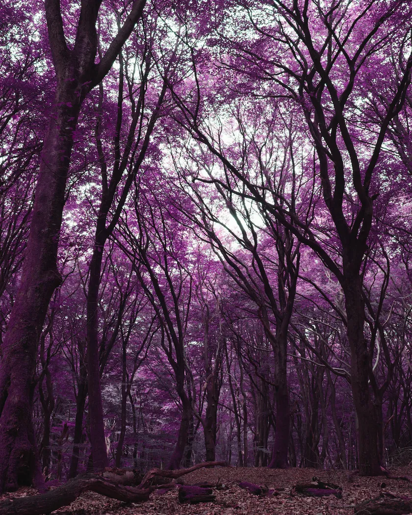
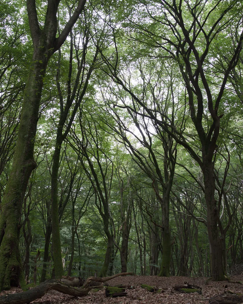
Translation into darktable
| Module | Role | Settings |
|---|---|---|
| rgb primaries | Swaps green and blue: greens turn purple, yellows pink, blues turquoise; reds held back | Green hue +2.30 rad, purity 0.75; blue hue −1.65 rad, purity 1.0; red hue +0.10 rad |
| color balance rgb (instance “film”) | Purple shadows, strong saturation | Shadows 300° / 0.04; saturation +8 %, vibrance +0.10 |
| color equalizer | Foliage pulled from magenta toward violet, skin rosy rather than magenta, softer turquoise | Magenta: hue −15°, saturation +10 %, brightness +5 %; red: hue +15°, saturation −5 %; cyan: saturation −15 %, brightness −5 % |
| tone curve (RGB, linked channels) | Medium contrast, slightly lifted ('muddy') blacks, soft shoulder | Nodes (0, 0.025) (0.1, 0.075) (0.25, 0.215) (0.5, 0.5) (0.75, 0.78) (0.9, 0.92) (1, 0.99) |
| grain | Grain of an ISO 400 color negative, a little stronger than the Portra 400 style, visible in the shadows | Coarseness 1600, strength 22, midtones bias 75 |
Measurements
The measurements come from a few test photos of our own, which are not published on this site. The photos shown here are different.
| Photo | Zone | Baseline | Metric | Before | After | Film expectation |
|---|---|---|---|---|---|---|
| 0775 | sky | Base rendering | h (hue, °) | 273.6 | 177.8 | Blue sky turns turquoise |
| 0775 | sky | Base rendering | C (chroma) | 27.5 | 36.7 | Strong saturation |
| 0775 | sky | Base rendering | L (lightness) | 55.3 | 66.2 | Light cyan or teal skies |
| 0775 | sea | Base rendering | h (hue, °) | 270.1 | 181.4 | Blues turn turquoise |
| 0989 | skin | Base rendering | h (hue, °) | 44.2 | 18.3 | Rosy skin |
| 0989 | skin | Base rendering | C (chroma) | 16.4 | 20.0 | Rosy skin |
| 1014 | pink T-shirt | Base rendering | h (hue, °) | 358.8 | 45.6 | Pink turns pale yellow |
| 1014 | pink T-shirt | Base rendering | C (chroma) | 33.7 | 24.6 | Pink turns pale yellow |
| 1014 | whole image | Base rendering | L5 (blacks) | 2.6 | 3.8 | Muddy shadows: blacks slightly lifted |
| 0775 | whole image | Base rendering | Lsd (contrast) | 14.3 | 16.0 | Medium contrast |
Base rendering: darktable’s default processing of the RAW file, without the preset. Luminance conversion (black and white): the same photo converted with plain luminance weights, to isolate the effect of the film’s spectral sensitivity.
What the style changes
The style sets five darktable modules. Lomography publishes no datasheet, so it rests entirely on reviews, summarized on the LomoChrome Purple film page. All figures below come from renders made with darktable-cli 5.6.0 at 1000 px, measured in CIELab.
- A green–blue swap. One model explains nearly every description: exchange the green and blue channels. Green becomes blue plus red, that is purple; blue becomes green; yellow (red plus green) becomes red plus blue, that is pink; red stays red; pink turns orange-yellow and violet turns green. This is our model, built from the descriptions, not a measurement of the film.
- Done in rgb primaries. The module builds a 3×3 matrix from rotated primaries while keeping white, and it runs after your color calibration, so grays stay neutral. The green primary is turned to the position of blue; the blue primary is turned toward cyan-green, stopping short of a full swap, which made skies plainly green.
- Test photos. The sky turns turquoise (hue 273.6° → 177.8°), more saturated (C 27.5 → 36.7) and lighter (L 55.3 → 66.2), which matches “light cyan or teal”. Photo 0775 as a whole gets lighter (L 53.2 → 61.0). Skin turns rosier (44.2° → 18.3°, C +22 %). A pink T-shirt turns beige-khaki (358.8° → 45.6°, C −27 %), the direction of the “pink becomes yellow” noted by one reviewer.
- A synthetic sRGB chart, because the test photos contain little vegetation (hue in degrees, before → after):
- foliage 121 → 330, grass 128 → 324, bright green 142 → 314: greens turn purple;
- sky 275 → 178: blue turns turquoise;
- yellow 93 → 344, orange 63 → 25: yellows turn pink, oranges pinkish-red;
- red 33 → 48: reds stay red, slightly toward orange;
- pink 353 → 62, violet 312 → 165: pink turns yellowish, violet green;
- light gray stays neutral; mid and dark grays turn slightly purple (C 2.2 and 4.8).
- Purple shadows and strong saturation. A color balance rgb instance named “film” tints the shadows purple and adds saturation and vibrance. The shadow of an arch goes from brown (hue 66°) to purple-red (357°).
- Separating foliage from skin. After the matrix, foliage comes out magenta-pink and skin close to it. color equalizer pulls magenta toward violet and red toward orange, and softens cyan.
- Medium contrast, lifted blacks, ISO 400 grain. Contrast rises slightly (Lsd 14.3 → 16.0 and 30.7 → 32.1) and blacks lift (L5 2.6 → 3.8), for the “muddy” shadows reviewers mention. Grain is a little stronger than in the Portra 400 style.
What it leaves alone
- Your base development. The style contains no exposure, no sigmoid or filmic, no white balance and no LUT. Those settings stay as you made them.
- Your color balance rgb. The style’s color balance rgb is a separate instance named “film”: it is added next to yours, which stays untouched.
- But not your rgb primaries, color equalizer, tone curve or grain. When you apply a style from the lighttable or the darkroom, each of its modules replaces the instance of the same module with the same name, if the photo has one, and is added otherwise. These four modules carry no instance name, so they replace any settings you had already made in them. Your earlier settings remain in the history.
- Your pipeline order. The style file carries no module order list, so it does not impose one on your image.
Exporting with a style, or rendering with darktable-cli, works differently: every module of the style is added as a separate instance. Our measurements were made that way, on darktable’s default rendering. The details are in Install and apply darktable styles.
Limits
- No datasheet. The curve and the grain are estimated from reviews.
- A hypothesis. The green–blue swap fits the descriptions, but the real sensitivities of the film’s layers are unknown. The central “hotspot” one reviewer saw on sunny frames is not simulated.
- One point on a moving target. On film, the look changes a lot with exposure and scanning, and reviewers disagree on the direction. The style fixes an intermediate look: turquoise sky, purple greens.
- Skin and foliage are close. After the matrix they sit near 10° and 340°, and color equalizer separates them imperfectly: skin comes out pinker than “natural”, foliage purple-magenta rather than violet-blue.
- Saturated orange-reds drift toward orange (a red-orange vest: 31° → 50°), where Analog.cafe reports “pinkish-red”.
- Slightly blue whites turn pale green through the same swap: a shirt with optical brighteners, a wall in the shade. Neutral whites stay neutral.
- Greens measured on the chart only. On the test photos, only the scrub on the islands of one landscape shows the effect, checked by eye: it turns mauve.
Tips
- The ISO effect is not built in. Reviewers get deeper purples at ISO 400 and paler, more turquoise results at 100 or 200. The style fixes one intermediate look; adjust the saturation of its “film” color balance rgb instance to taste.
- Apply it early. If you plan to fine-tune the tone curve, rgb primaries, color equalizer or grain yourself, apply the style first: it would replace those settings if you made them before.
- Installation: see Install and apply darktable styles.
Get the preset
GA — 026 / P · darktable preset
LomoChrome Purple
for darktable